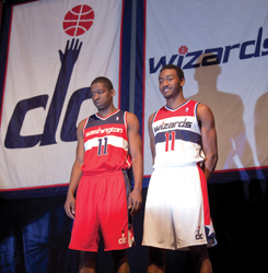
With a nod to their past, the Washington Wizards last week unveiled their new red-white-and-blue uniforms, along with two new secondary marks and an updated primary logo.
The Wizards’ new design links the team’s look with the old Bullets uniforms before late owner Abe Pollin changed the team’s name and colors in 1997 when he opened the team’s downtown Washington, D.C., arena.
 |
AP IMAGES
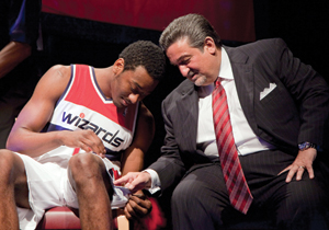
Left: Jordan Crawford and John Wall show off the Wizards’ new uniforms at the unveiling last week. Above: Wall and owner Ted Leonsis check out one of the new logos. |
 |
AP IMAGES
|
It also aligns the Wizards’ brand with other Monumental Sports & Entertainment teams, the Capitals and WNBA Mystics.
One of the Wizards’ new secondary logos features a lowercase “dc”. The other new secondary mark is a basketball with the image of the Washington Monument integrated into the design and topped with a star. The tweaked Wizards primary mark features the new red-white-and-blue color scheme.
The “Wizards” name is on the front of the home white jersey, with “Washington” on the front of the road red uniform.
The Wizards’ new branding effort became a priority for owner Ted Leonsis after he bought majority interest in the Wizards from Pollin’s estate and created Monumental Sports & Entertainment last June.
“There are a lot of elements of yesteryear, but enough twists to the design that make it fresh,” said Greg Bibb, the Wizards’ executive vice president of business operations. He said the team worked with the NBA and a design team from Adidas for the better part of a year on the redesign.
The Wizards will continue their rebranding with a new line of merchandise expected in a few weeks and a redesigned court at Verizon Center to be ready for next season.