No fan wants it to happen to their team — not in their backyard.
Whenever a pro team introduces a new primary logo, the reaction is immediate, virulent and unmistakably negative. So when the Miami (nee Florida) Marlins’ new logo was leaked last October, much of the digital sport logo hoi polloi pounded on the trademark like they would a mouse if it appeared in a children’s nursery.
Need evidence? At the risk of lending credibility to any of these outlets, here’s a sampling of the initial response.
SB Nation said the new Marlins mark “looked like Tron light cycles having an orgy,” later claiming it would “actually cause serious retinal injuries.” That was relatively mild criticism.
Miaminewtimes.com headlined “Marlins Float Hideous Monstrosity of a New Logo to Go With Eyesore of a New Stadium.”
Marlinsnation.com had a video labeling it “the worst logo in history.”
Perhaps the hatred from bloggers was rooted in fans’ passion for the original Marlins logo when the team launched in 1993, as it featured a traditional mark other than its use of the popular teal. Teal was part of the inaugural jerseys of the Charlotte Hornets (1988) and San Jose Sharks (1991) at the beginning of sports licensing’s boom in the 1990s.
That teal logo also adorned the uniforms of a Marlins team that won two World Series in its first 11 years, which fomented an emotional attachment well beyond the abilities of any graphic designer.
“There was more negative reaction than usual. Fans were really hoping for a return to the teal and what they got was the complete opposite — a look like we’ve never seen in baseball,” said Chris Creamer, whose 15-year-old Sportslogos.net site is a virtual museum of sports branding, with more than 13,000 logos. “I admit to being shocked at first, like most people, but I’m coming around.”
One can argue the aesthetics of any design, but at least in the first few months of a rebrand that encompasses the new logos, the addition of the word “Miami” on the home uniforms, a new $515 million ballpark with a retractable roof (see related story), a new manager in Ozzie Guillen and more than $190 million in top-shelf free agent contracts, the new logo is a commercial smash.
Certainly, any new primary logo will jump-start apparel sales, but as always, on-field performance will be the ultimate arbiter of sales success. Even so, retailers and manufacturers known for being “cautiously optimistic” at best about anything “new” are effusive in their praise of the Marlins’ fresh mark.
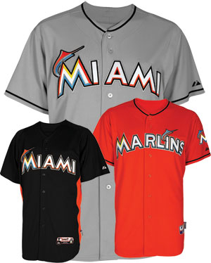 |
The “Miami orange / red” alternate jerseys are the only ones that say Marlins.
|
David Trujillo, director of sales and operations for The Sports Authority’s South Region in Florida, which encompasses more than 125 stores, said that in his area, the new Marlins caps were selling at a rate double that of any other Sports Authority market.
“It’s one of the hottest things down here; for the past couple of months it’s actually been outselling the Miami Heat,” Trujillo said. “Originally, there was lots of [negative] talk about the logo and the colors, but I’ll tell you what, the colors are why it’s selling.”
But he’s not alone in touting the numbers: New Era spokeswoman Dana Marciniak reports that MLB’s on-field cap rights holder sold 30,000 of the old Marlins caps last November; since then they have sold 200,000 — a solid 60 percent increase to more than 50,000 sales per month.
Jim Pisani, president of VF’s licensed sports group, said sales of Majestic’s on-field Marlins jerseys had moved from middle of the pack to top five in the league.
“Certainly, you have to put wins on the board, but looking out there as the season opens, you’d have to say everything about the Marlins rebrand is working,” Pisani said.
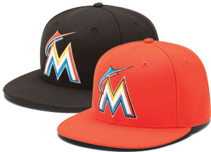 |
Cap sales have increased 60 percent since November.
|
Brian Swallow, senior vice president of strategy and business development at Jacksonville-based sport merchandiser Fanatics Inc., pulled data that showed a 280 percent increase in Marlins sales since the logo was introduced on Nov. 11. The data does not include MLB.com, which Fanatics administers, but Swallow said “our sales trends match up with our league partners.”
MLB licensing chief Howard Smith was reluctant to reveal specifics on how far up the sales ladder the Marlins have climbed since the unveiling, “but for me to be talking to you about Marlins sales moving our entire business, it has to be a substantial move,” he said.
Marlins owner Jeffrey Loria says the new logo is challenging the Yankees for first place. “It’s one of the top-two selling logos in Major League Baseball,” he said, with unmistakable pride. “People finally get it. Maybe that proves everything is an educational process. … So the early proof is in the sales, but for me, it’s creating this as part of a whole that’s so satisfying.”
So much for the blogosphere, at least when it comes to picking a winning mark.
First, the colors seem to work. The mix of “red/orange” and “ocean blue” for the marlin fish, which looks like it would have fit nicely on the hood of a car coming out of Detroit in the 1950s, intertwined with an “M” that carries “sunshine yellow,” “nightclub black” and “energy silver” is checking at retail.
Overall, the logo development was a 28-month process — but it took naysayers less than five minutes to shoot it down on the Web — especially after an early and not-quite-accurate version was leaked in October.
“It’s always this way,” said SME Branding senior partner Ed O’Hara, whose firm has worked on about a dozen MLB redesigns over the years before landing the Marlins assignment.
“When we did the Tampa Bay [Lightning] redesign [in 2011] there was a ‘New Lightning Logo Sucks’ Facebook page up in less than an hour,” he said, with a laugh.
Added MLB’s Smith, “It could have been a logo as classic as the Cubs and Yankees — combined. There would still be people complaining. Probably the same people.”
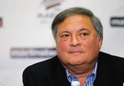 |
“I certainly know and understand history, but Miami is a lively and energetic city with a great flair for the contemporary.”
Jeffrey Loria
Miami marlins owner
Photo by: GETTY IMAGES
|
Loria, who made his fortune as an art dealer, and favors the works of Miro, Picasso and Henry Moore, downplayed the impact his fine-arts knowledge had on the new logo. However, Anne Occi, MLB vice president of design, a veteran of dozens of logo changes during her 22 years at MLB, noticed the difference immediately. “Like no other owner I’ve worked with, [Loria] really had an eye for color,” Occi said.
“He’s a colorist and it showed,” agreed O’Hara, while also recalling being intimidated during an early meeting at Loria’s New York gallery.
“There I was, a fine arts major, pitching baseball logos with the works of Picasso and Léger staring down at me. I didn’t know whether to laugh or cry,” O’Hara said.
Loria insisted it was less about aesthetic expertise or deriving inspiration from any specific artist than it was about charting a course and following it, especially in a sport as tradition-bound as baseball.
“I certainly know and understand history,” Loria said, “but Miami is a lively and energetic city with a great flair for the contemporary. The design and execution of the new stadium, with glass, steel, plaster and white concrete, is no different from the look of the mark.”
O’Hara’s recollection was that in their first meeting, Loria told him it would take 1,000 logos to get to the right one, “and we came pretty close to that number,” O’Hara said.
Loria’s recollection differed, but both men said that from the outset, the intent was to create something that was altogether different. “[Loria] told me ‘I want bling.’ The main dimension of MLB is tradition, but he didn’t drink that Kool Aid,” O’Hara said.
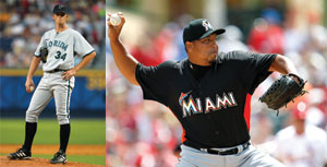 |
“Miami” replaces “Marlins” on the team’s new home uniforms.
Photo by: GETTY IMAGES (2)
|
Loria doesn’t like the term “disruptive.” “I’d prefer innovative,” he said, “but it was a rebrand from the bottom up.”
In the end, it took 29 “phases” of logo design to come up with the final mark. By way of comparison, the Tampa Bay Lightning redesign took six phases. Bumps along the way to a new Marlins mark included the discovery of similar logos for The Grand Marlin restaurant in Pensacola, Fla., and the Miami Chamber of Commerce.
SME, which also did a recent redesign for the Baltimore Orioles, came to the process with what, in MLB circles, was a radical idea: Put the city’s name on the front of the home jersey rather than the team’s nickname, which is the norm. Since the Marlins were rebranding from “Florida” to “Miami,” the idea seemed natural to O’Hara.
“The idea was to commemorate the move and, frankly, we thought it would generate more sales,” he said. “If I’m a German or French tourist in Miami, I’m going to buy that jersey.”
Early concerns were how abstract the figurative marlin should be, since the old logo was a literal representation of the fish. Some suggested versions more akin to the Nike swoosh than an aquatic creature. The number of colors in the logo was another topic for discussion. Later, a focus group of season-ticket holders convinced the design team to pare the number of colors in the logo from seven to five and to make the marlin somewhat less abstract.
 |
The team’s logo development spanned 28 months. Merchandise sales since its introduction have skyrocketed.
Photo by: MIAMI MARLINS |
“Like a lot of the people that saw the leaked logo, the initial thought was this is the Houston Astros uniforms of the ’70s. That was never the direction and once people in the focus groups saw the uniforms, they understood,” O’Hara said.
Nothing came easily during the process, and picking the “reddish orange” tone to represent a Florida sunset took nearly three months.
While being careful to avoid the orange tones used by the New York Mets, Baltimore Orioles, Detroit Tigers and San Francisco Giants, after some back and forth, the color selected was in the Pantone color system (“warm red”). Still, it was not on MLB’s uniform color palette, which meant even more months of back and forth with various baseball licensees and their suppliers to get a cap with that red/orange that matched the one on the uniform logos. Thread samples sometimes took more than a month to produce, making it a difficult, and slow, exercise.
“We took it to the limit,” said Occi, who calls the elusive color “orange/red with rhythm.” But she adds, “We achieved [Loria’s] vision through that use of a unique color.’’
One of the team’s alternate jerseys is entirely “Marlins orange/red” that’s the only one that says Marlins, instead of Miami.
Other than style and color, the Marlins cap logo in particular took MLB fashion to new heights of intricacy. The average stitch count for an MLB logo is 6,000; the new Marlins cap logo uses 10,973 stitches, the most of any MLB team.
One could make the case that any team with the amount of dramatic change that the Marlins have wrought, along with a new and bold park, should of course generate box office return in its initial months. Still, they are exceeding all expectations from a sales perspective. Longer term, it will be interesting to see if the team’s new identity and color palette spurs imitators.
“I’d be willing to wager you that other teams will follow,’’ said Loria, adding that he’s already been contacted by another MLB owner looking to do something similar. “This is baseball, so tradition is important and I am very steeped in it. But experimentation and vision are also essential.”
 |
| Many versions of the new Miami Marlins logo were developed before the eventual design (far right) came out on top. At far left is the original Florida Marlins logo. |